M01operated by an in-house team of two, without a single exception
1
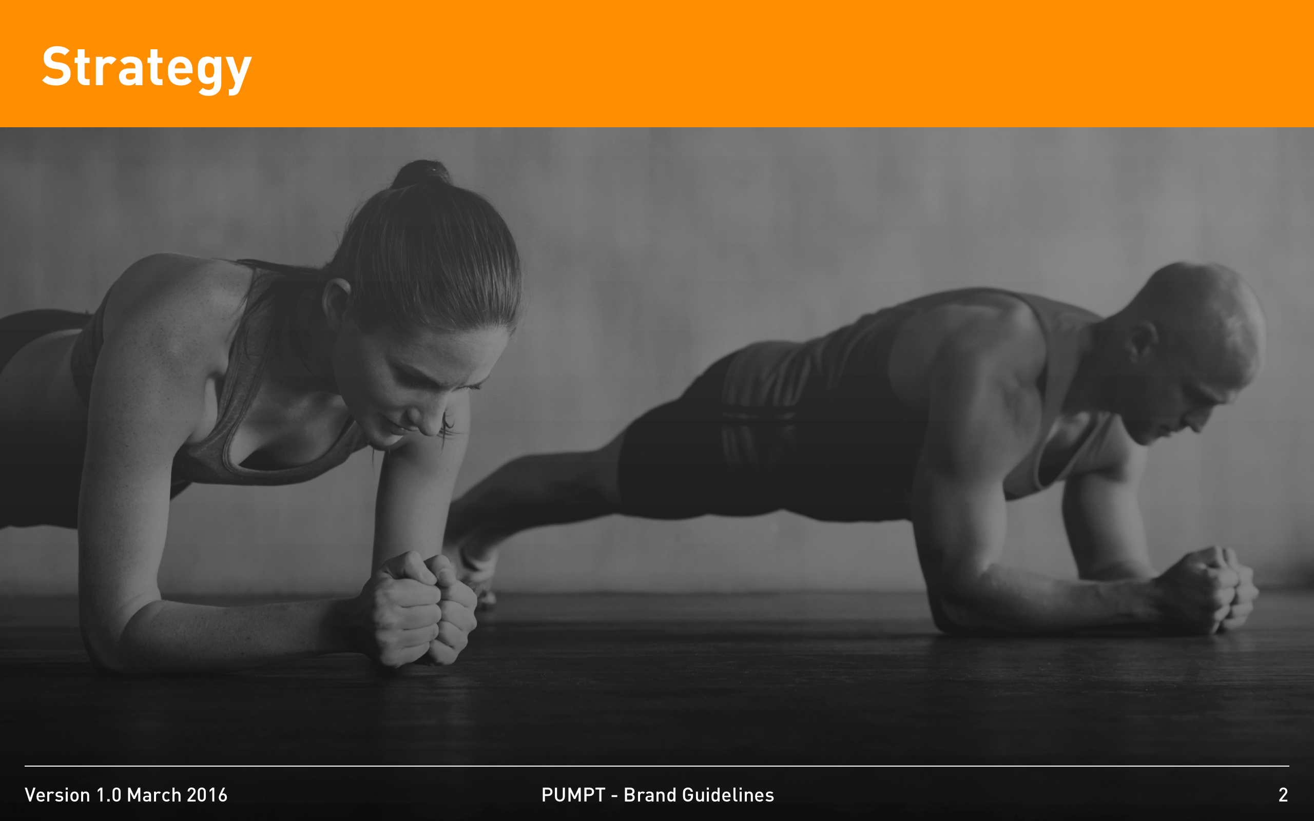
Brand book

Pumpt needed a brand identity that could carry both a consumer-facing surface and a partner-facing one without splitting in half the moment the team scaled past three people.
The brief was a complete identity system plus the guidelines a small team could apply without our help. We treated the guidelines as the deliverable — the visual system was a means to that end. Every primitive was designed with a single, defensible reason; every exception was documented in advance; and the type system was held to four sizes across every surface so that consistency would not depend on taste. The result is a brand book that has survived the operational pressure of a real scale-up team without generating the slow, accumulating drift that brand systems usually accumulate in their second year.
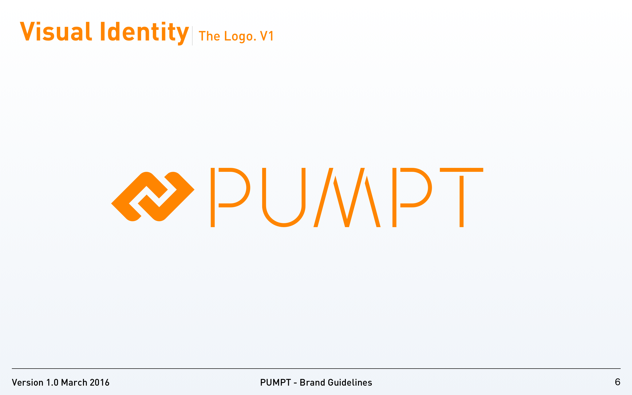
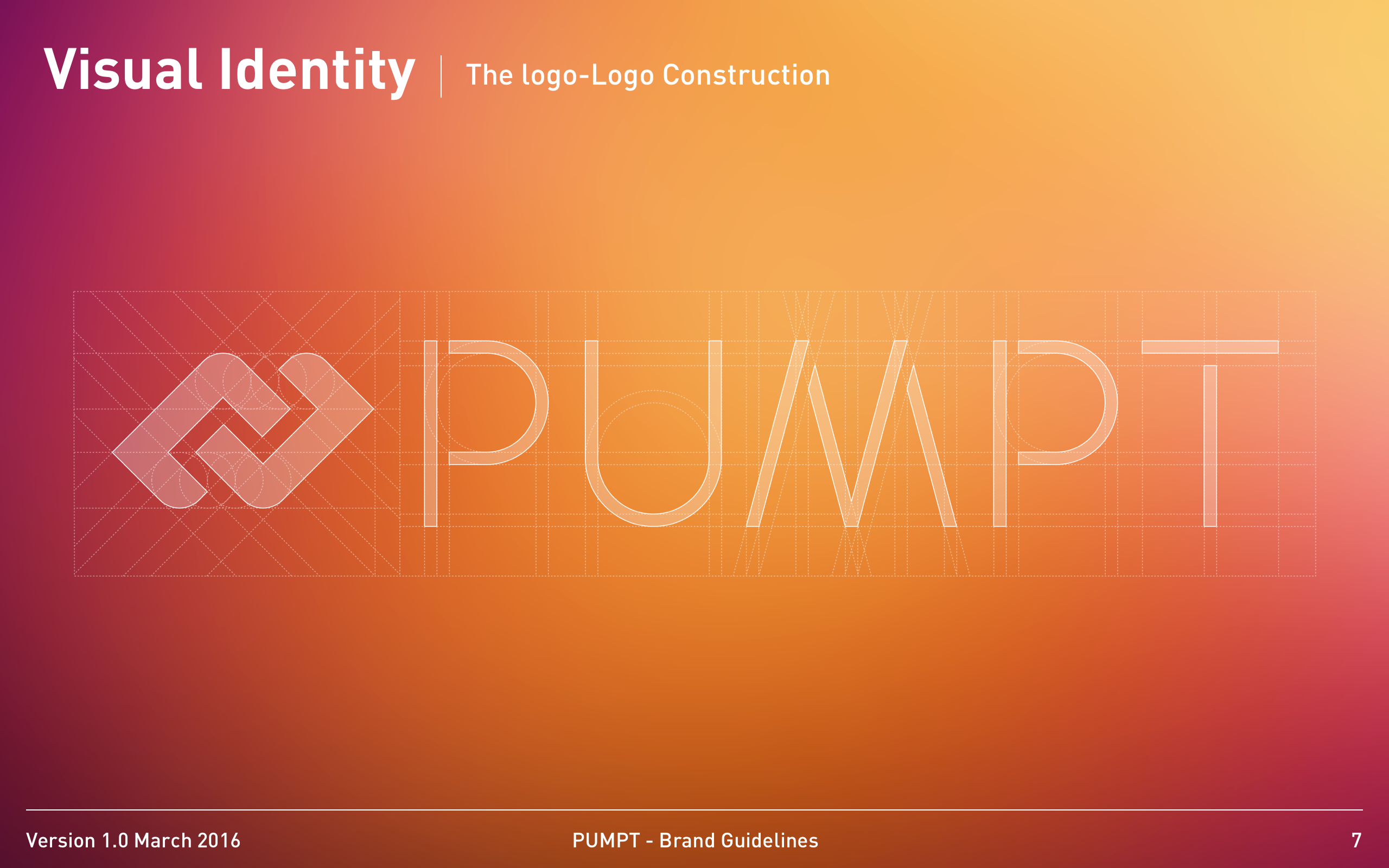
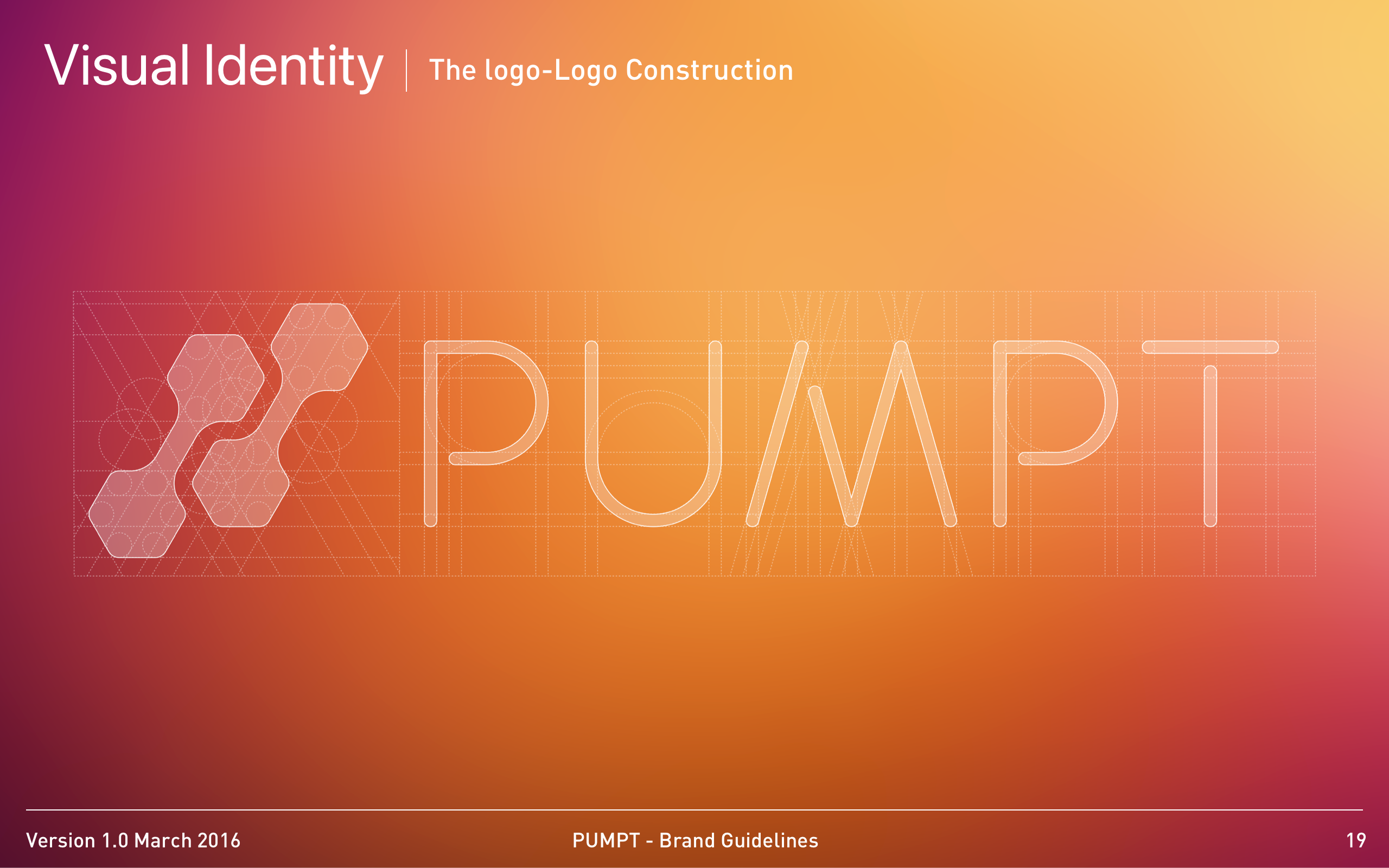
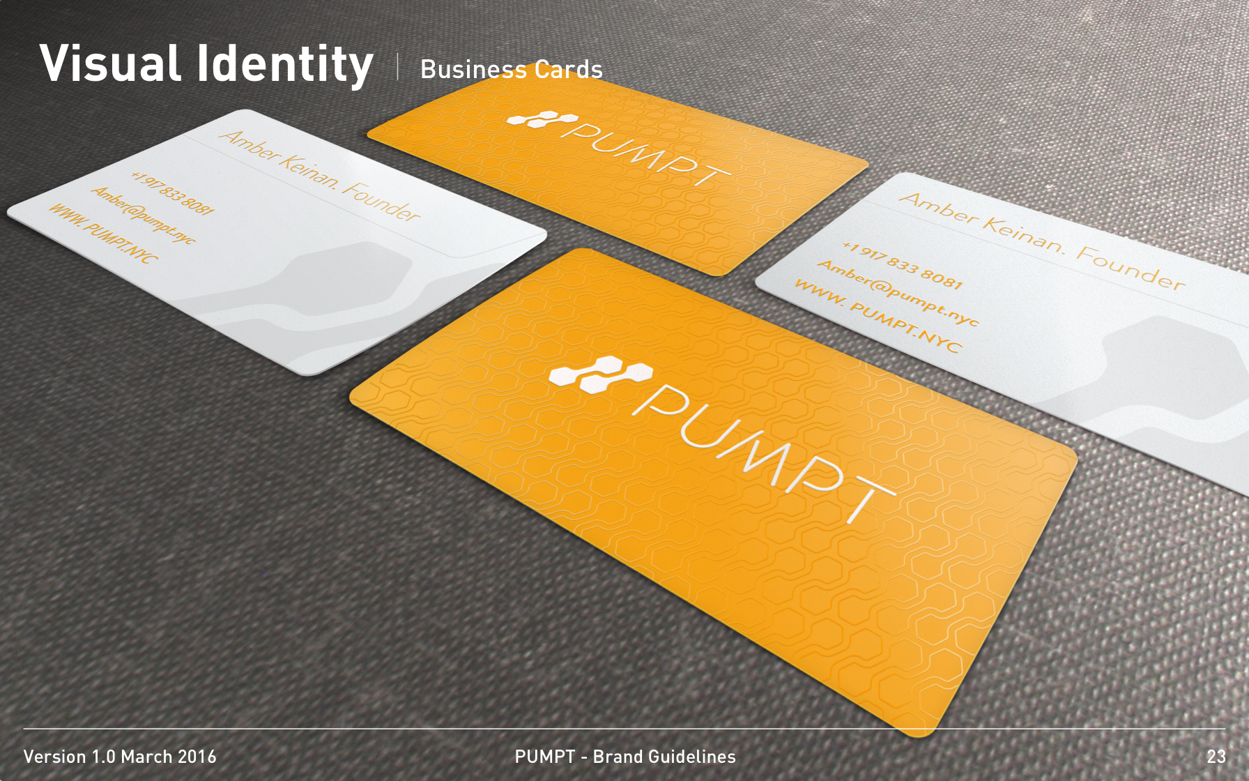
We wrote the guidelines structure before drawing the wordmark. The mark was then designed against the structure, not the other way around — every primitive had a documented reason before it acquired a shape.
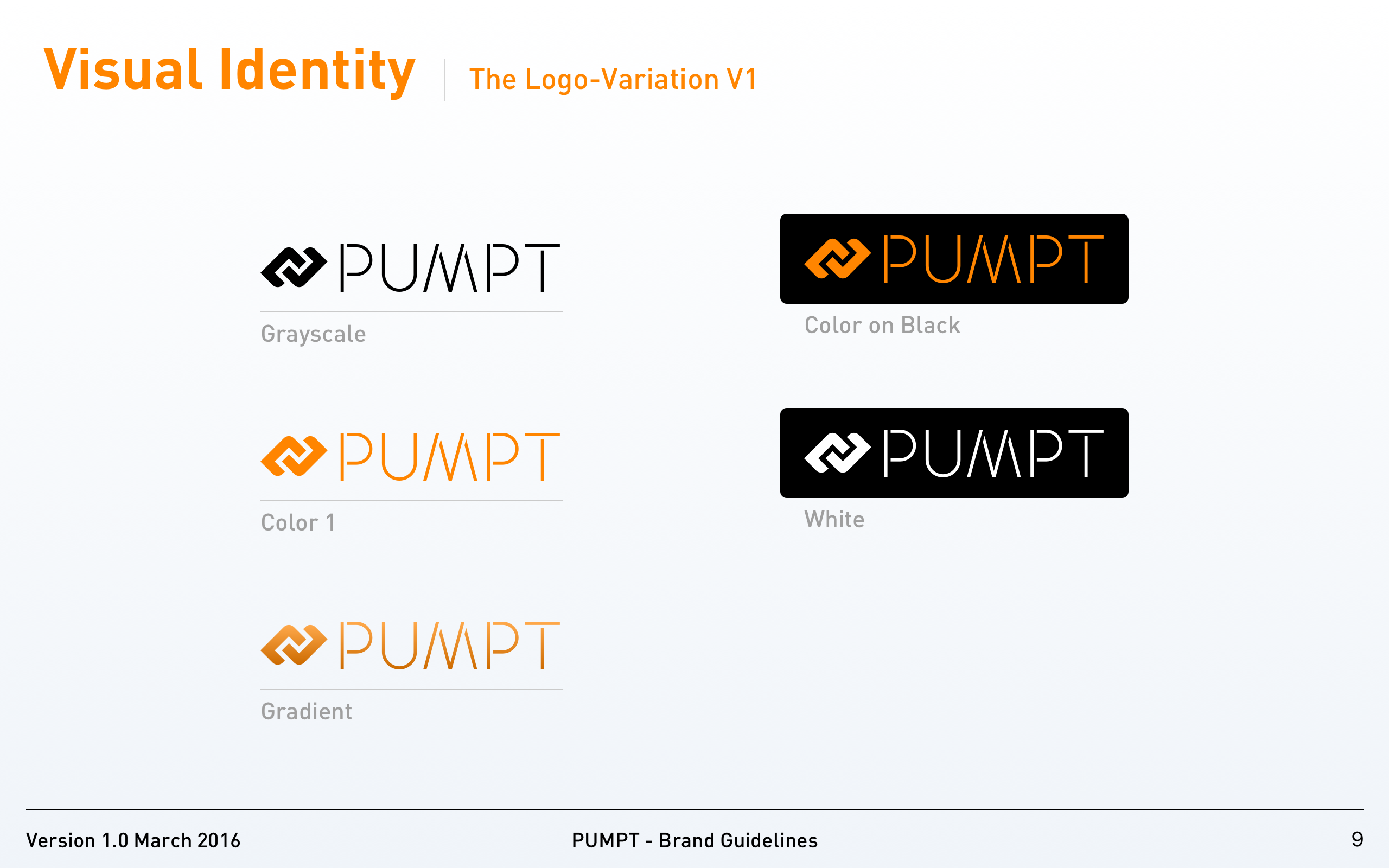
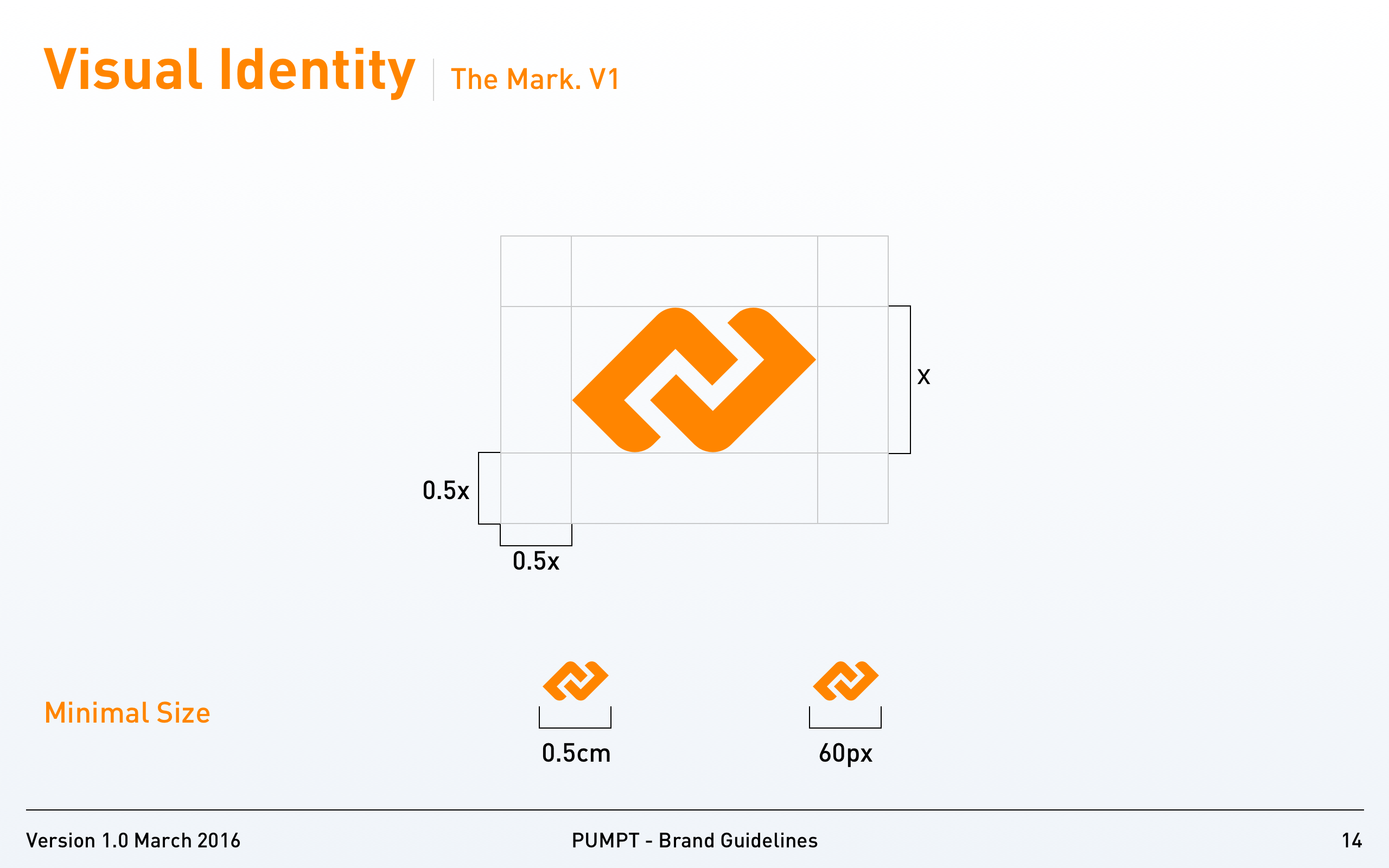
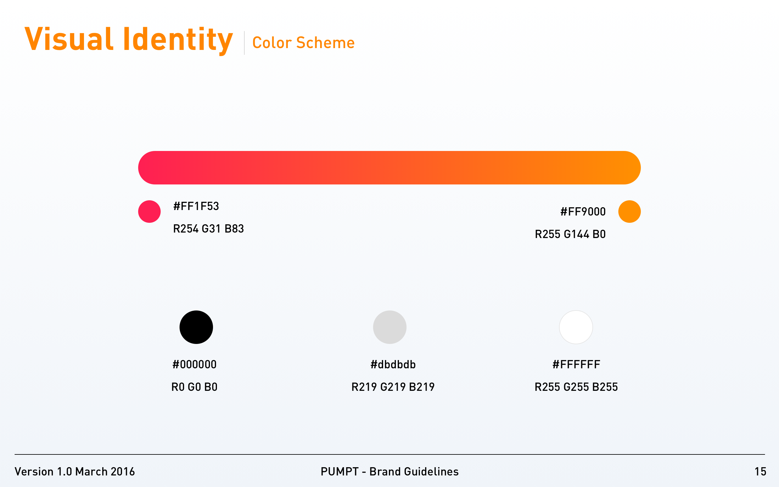
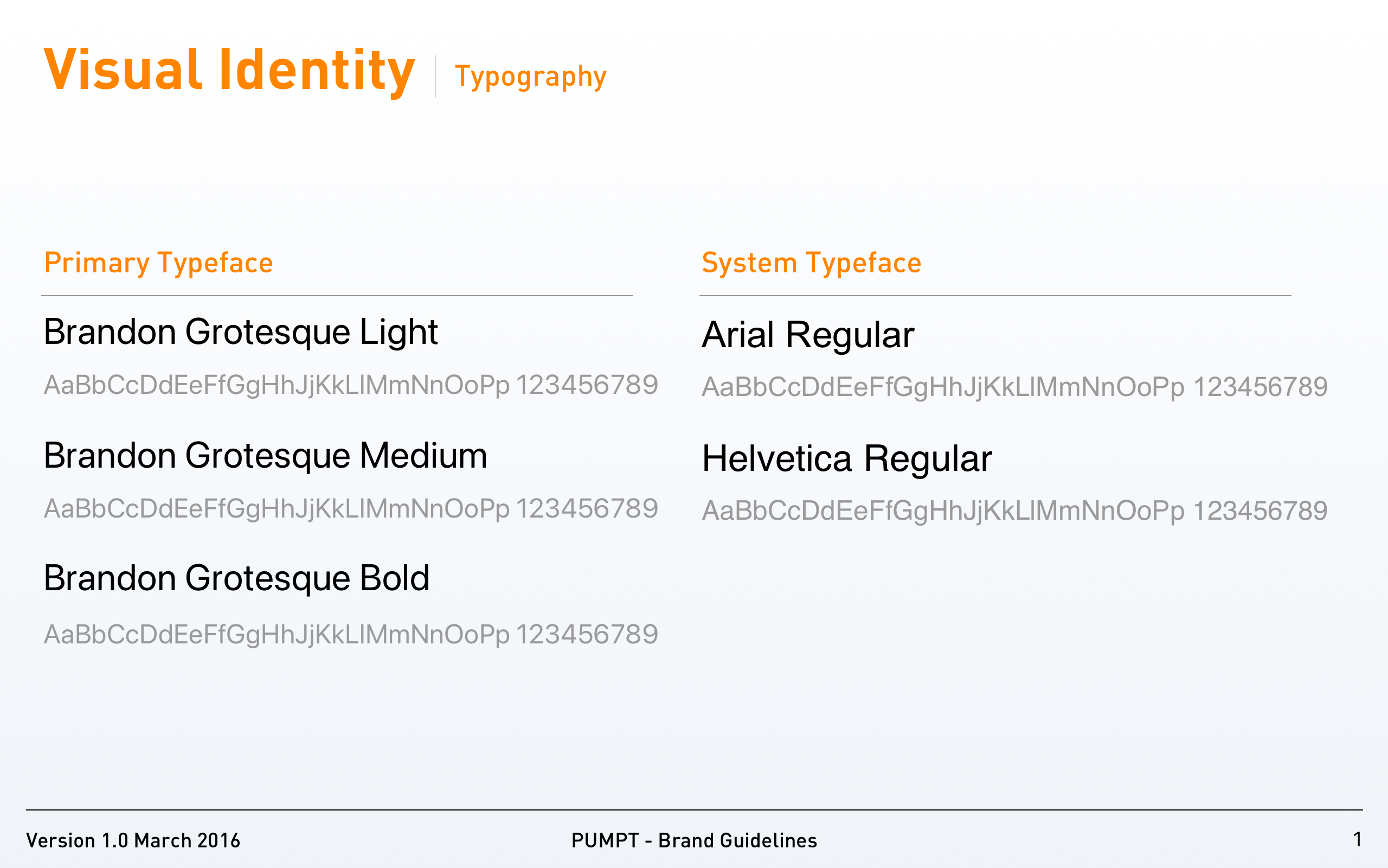
The type system is constrained to four sizes across every surface. Consistency is therefore not a matter of taste; it is a matter of the team selecting from a list of four. After twelve months in production, no one has asked for a fifth.
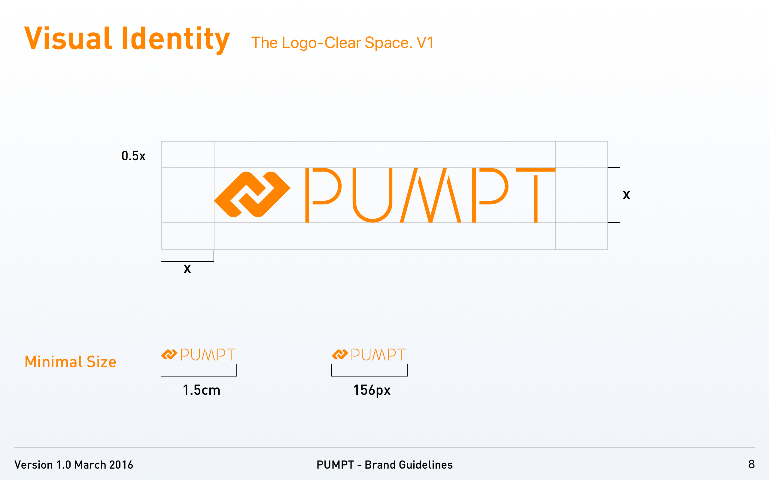
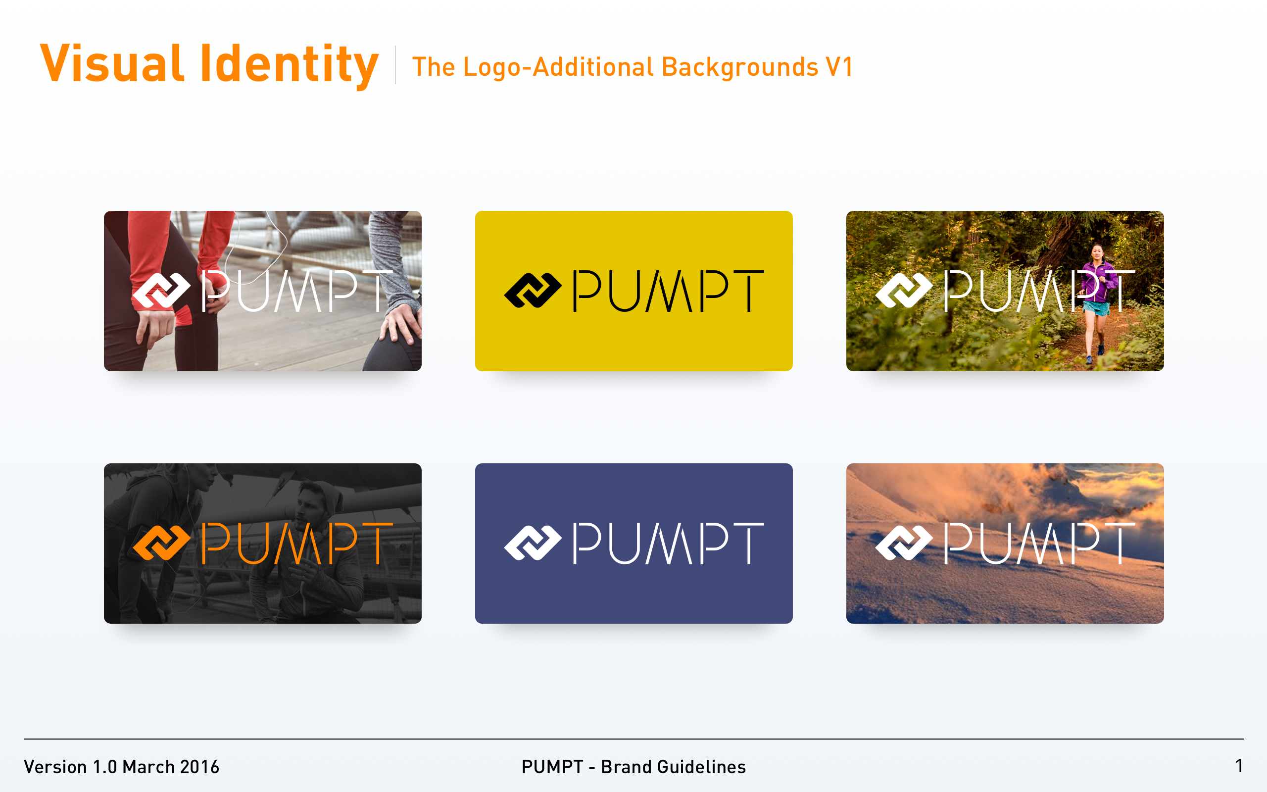
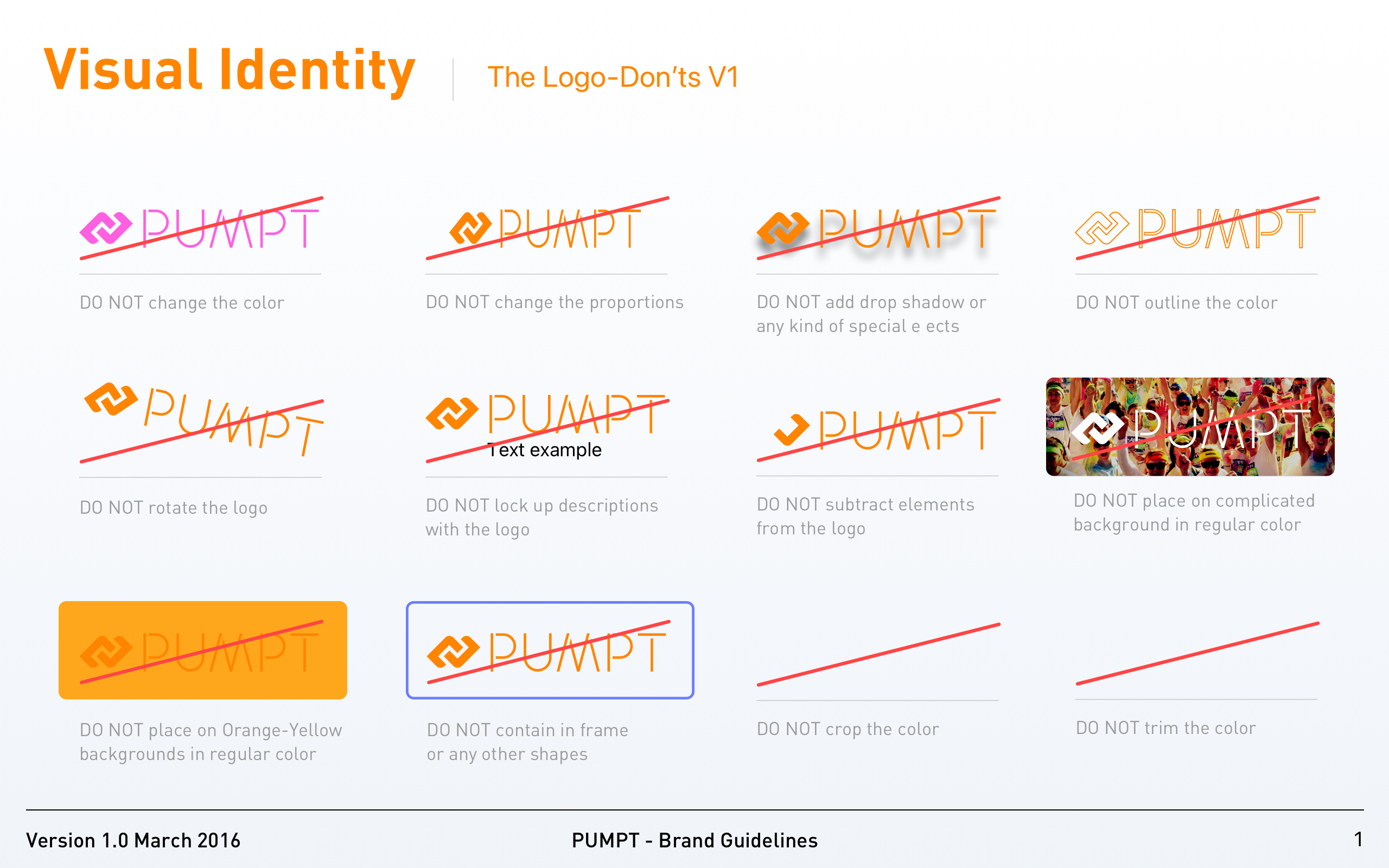
Every exception the system permits is documented up front. Teams do not have to discover what the brand allows by submitting a piece for review — they read the rule, find the exception, and ship.


Brand book
Without a guideline exception
Sub-brands
Send a short brief — we'll reply with concrete next steps. New engagements are limited each quarter.